Enhancing Targeting Accuracy using ML

The goal for the project is to build a model that would accurately predict the customers that would sign up for our client’s delivery club services. We use different classification algorithms to perform this task and understand what the main drivers are.
- Project Overview and Results
- Data Overview
- Data Import
- Preprocessing
- Split Out Data for Modelling
- Model 1: Logistic Regression
- Model 2: Decision Trees
- Model 3: Random Forest (Ensemble)
- Model 4: K Nearest Neighbors (KNN)
- Results
- Application
- Growth & Next Steps
Project Overview and Results
Problem Statement: Our client, a grocery retailer, sent out mailers in a marketing campaign for their new delivery club. This cost customers $100 per year for membership, and offered free grocery deliveries, rather than the normal cost of $10 per delivery. For this, they sent mailers to their entire customer base (apart from a control group) but this proved expensive. For the next batch of communications, they would like to save costs by only mailing customers that were likely to sign up. Based on the results of the last campaign and the customer data available, we will look to understand the probability of customers signing up for the delivery club. This would allow the client to mail a more targeted selection of customers, lowering costs, and improving ROI.
The goal of this project is to build a model that would accurately predict the customers that would sign up for our client’s delivery club services. This would allow for a much more targeted approach when running the next iteration of the delivery club campaign. A secondary goal is to understand what the drivers for delivery club signups are, so the client can get closer to the customers that need or want this service, and enhance their messaging.
The data was cleaned, preprocessed and split into training and testing sets; four different models were used in the modelling process and based on the goals of the project, the model of choice is the Random Forest model as it was:
- the most consistent performant on the test set across classification accuracy, precision, recall, and F1-score, and
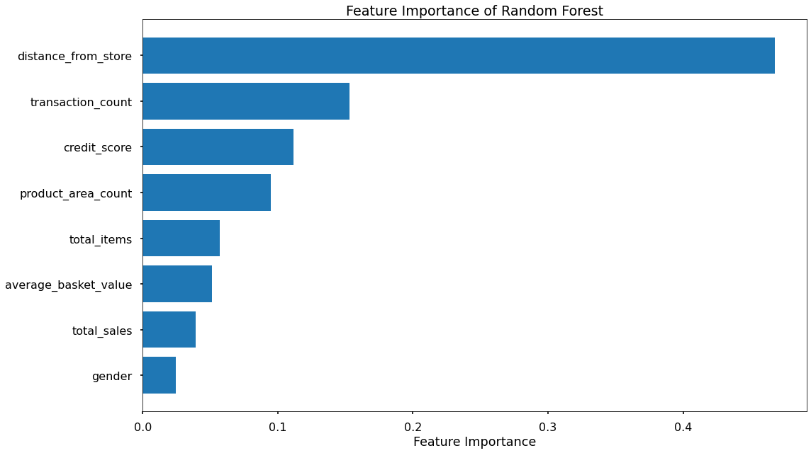
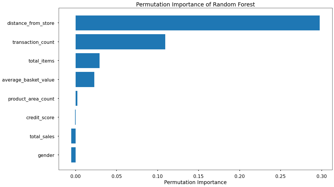
- the feature importance and permutation importance allow the client an understanding of the key drivers behind delivery club signups. See the table below for a summary of all model results.

Data Overview
We will be predicting the binary signup flag from the campaign_data table in the client database. The key variables to predict this will come from different tables, which we have joined and aggregated to come up with the final dataset. We focused on aggregating data 3 months before the last campaign date.
The final table of data for modelling looks something like this:
| Variable Name | Variable Type | Description |
|---|---|---|
| signup_flag | Dependent | A binary variable showing if the customer signed up for the delivery club in the last campaign |
| distance_from_store | Independent | The distance in miles from the customers home address, and the store |
| gender | Independent | The gender provided by the customer |
| credit_score | Independent | The customers most recent credit score |
| total_sales | Independent | Total spend by the customer in ABC Grocery - 3 months pre campaign |
| total_items | Independent | Total products purchased by the customer in ABC Grocery - 3 months pre campaign |
| transaction_count | Independent | Total unique transactions made by the customer in ABC Grocery - 3 months pre campaign |
| product_area_count | Independent | The number of product areas within ABC Grocery the customers has shopped into - 3 months pre campaign |
| average_basket_value | Independent | The average spend per transaction for the customer in ABC Grocery - 3 months pre campaign |
Data Import
The first step is to import important packages such as pickle (we saved our final table as a pickle file), pandas, matplotlib etc.
# import required packages
import pandas as pd
import pickle
import matplotlib.pyplot as plt
import numpy as np
from sklearn.linear_model import LogisticRegression
from sklearn.utils import shuffle
from sklearn.model_selection import train_test_split, cross_val_score, KFold
from sklearn.metrics import confusion_matrix, accuracy_score, precision_score, recall_score, f1_score
from sklearn.preprocessing import OneHotEncoder
from sklearn.feature_selection import RFECV
import plotly.express as px

# import modelling data
data_for_model = pickle.load(open("data/delivery_club_modelling.p", "rb"))
For modelling purposes, the customer_id does not add value to our model, so we remove it from the dataset. It is also necessary to shuffle our data to introduce randomness into the dataset (if it isn’t randomized already).
# drop uneccessary columns
data_for_model.drop("customer_id", axis = 1, inplace = True)

# shuffle data
data_for_model = shuffle(data_for_model, random_state = 42)
Since this is a classification problem, it is a good idea to understand the class balance in the dataset. This would affect what metrics would be most useful in assessing our model.
# assess class balance of dependent variable
data_for_model["signup_flag"].value_counts(normalize = True)
The result of the code above tells us that 69% of customers did not sign up and 31% did. This tells us that while the data isn’t perfectly balanced at 50:50, it isn’t too imbalanced either. Because of this, and as you will see, we make sure to not rely on classification accuracy alone when assessing results - we also analyze Precision, Recall, and F1-Score to give us a complete picture.
Preprocessing
Missing Values
The number of missing values in the data was extremely low (<1%), so instead of applying any imputation (i.e. mean, most common value), we will just remove those rows.
# remove rows where values are missing
data_for_model.isna().sum()
data_for_model.dropna(how = "any", inplace = True)
Outliers
Outliers investigation/removal is an important step in preprocessing data as outliers could hamper the ability of models to generalize. Let’s use the describe() method to investigate the spread of values for our inputs.
| metric | distance_from_store | credit_score | total_sales | total_items | transaction_count | product_area_count | average_basket_value |
|---|---|---|---|---|---|---|---|
| mean | 2.61 | 0.60 | 968.17 | 143.88 | 22.21 | 4.18 | 38.03 |
| std | 14.40 | 0.10 | 1073.65 | 125.34 | 11.72 | 0.92 | 24.24 |
| min | 0.00 | 0.26 | 2.09 | 1.00 | 1.00 | 1.00 | 2.09 |
| 25% | 0.73 | 0.53 | 383.94 | 77.00 | 16.00 | 4.00 | 21.73 |
| 50% | 1.64 | 0.59 | 691.64 | 123.00 | 23.00 | 4.00 | 31.07 |
| 75% | 2.92 | 0.67 | 1121.53 | 170.50 | 28.00 | 5.00 | 46.43 |
| max | 400.97 | 0.88 | 7372.06 | 910.00 | 75.00 | 5.00 | 141.05 |
Another fun way of visualizing the spread of data is using a box plot to visually check where there are obvious outliers.
data_num = data.select_dtypes('number')
data_num.drop(["signup_flag"], axis = 1, inplace = True)
data_num.plot(kind= 'box', subplots= True, layout = (3, 3), sharex= False, sharey= False, figsize =(16, 10) )
plt.show()
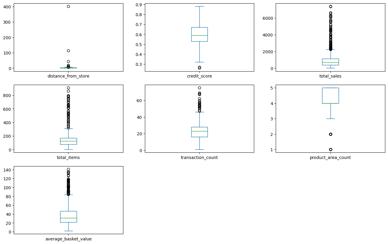
From the boxplots above, outliers seem to exist in all columns except for credit score and product area count. To remove these outliers, we will use the “boxplot approach” where we remove any rows where the values are outside of 2 x interquartile range.
outlier_investigation = data.describe()
outlier_columns = ['distance_from_store', 'total_sales', 'total_items', 'transaction_count','average_basket_value']

for column in outlier_columns:
    lower_quartile = data[column].quantile(0.25)
    upper_quartile = data[column].quantile(0.75)
    iqr = upper_quartile - lower_quartile
    iqr_extended = iqr * 2
    min_border = lower_quartile - iqr_extended
    max_border = upper_quartile + iqr_extended

    outliers = data[(data[column] < min_border)|(data[column] > max_border)].index
    print(f"{len(outliers)} outliers detected in column {column}")

    data_for_model = data.drop(outliers)
Split Out Data for Modelling
Now that we have cleaned our data, we can split into X (input) and y(output) variables, and then split into train and test sets to ensure that we can validate the accuracy of the predictions on data not used in the training.
X = data_for_model.drop("signup_flag", axis = 1)
y = data_for_model.signup_flag
X_train, X_test, y_train, y_test = train_test_split(X, y, test_size = 0.2, random_state = 23, stratify = y)
In the code above, we have elected to use 80% of our data for training (and use 20% for assessing the accuracy of the model). The argument stratify=y is to ensure that both our training and test sets have the same proportion of customers who did and did not sign up for delivery club - ensuring a robust dataset both for training and testing the model.
Model 1: Logistic Regression
Encoding Categorical Variables
Machine learning models typically cannot process string variables, so when there are text data within a data set, we would encode them (change them to numbers, typically binary) so that the algorithm can assess the relationship between the variable and the output. We could use One Hot Encoding (OHE) or Label Binarizer from the sklearn.preprocessing library.
An extremely efficient way of encoding categorical variables and scaling the inputs is by using DataFrameMapper from sklearn.pandas library. All the variables are scaled in one step.
# Instantiate the mapper
mapper = DataFrameMapper([
    (['distance_from_store'], StandardScaler()),
      ('gender', LabelBinarizer()),
      (['credit_score'], StandardScaler()),
      (['total_sales'],StandardScaler()),
       (['total_items'], StandardScaler()),
      (['transaction_count'],StandardScaler()),
      (['product_area_count'],StandardScaler()),
       (['average_basket_value'], StandardScaler())], df_out = True)

# Fit the mapper to training dataset only
mapper.fit(X_train)

# Transform both train and test sets
Z_train = mapper.transform(X_train)
Z_test = mapper.transform(X_test)
Feature Selection
Feature Selection is the process used to select the input variables that are most important to your Machine Learning task. It can be a very important addition or at least, a consideration, in certain scenarios. The potential benefits of Feature Selection are:
- Improved Model Accuracy - eliminating noise can help true relationships stand out
- Lower Computational Cost - our model becomes faster to train, and faster to make predictions
- Explainability - understanding & explaining outputs for stakeholders & customers becomes much easier
Feature selection can either be done by common sense - common sense feature selection can be as simple as taking out variables we know would absolutely not contribute to the model - like customer_id which we took out in the first few steps. We can also use tools like Correlation Matrix showing variable relationships, or Univariate Testing which helps us understand statistical relationships between variables or even more powerful approaches like Recursive Feature Elimination (RFE) which is an approach that starts with all input variables, and then iteratively removes those with the weakest relationships with the output variable.
For our task, we applied a variation of Recursive Feature Elimination called Recursive Feature Elimination With Cross Validation (RFECV) where we split the data into many “chunks” and iteratively trains & validates models on each “chunk” separately. This means that each time we assess different models with different variables included, or eliminated, the algorithm also knows how accurate each of those models was. From the suite of model scenarios that are created, the algorithm can determine which provided the best accuracy, and thus can infer the best set of input variables to use!
# Instantiate RFECV and the model to be used
clf = LogisticRegression(random_state = 43, max_iter = 1000)
feature_selector = RFECV(clf)

# Fit RFECV to training data
fit = feature_selector.fit(Z_train, y_train)

# Extract and print the optimal no of features
optimal_feature_count = feature_selector.n_features_
print(f"Optimal no of features is {optimal_feature_count}")

#limit train and test data to only include selected variables
Z_train = Z_train.loc[:, feature_selector.get_support()]
Z_test = Z_test.loc[:, feature_selector.get_support()]
The below code then produces a plot that visualizes the cross-validated classification accuracy with each potential number of features
plt.style.use('seaborn-poster')
plt.plot(range(1, len(fit.cv_results_['mean_test_score']) + 1), fit.cv_results_['mean_test_score'], marker = "o")
plt.ylabel("Classification Accuracy")
plt.xlabel("Number of Features")
plt.title(f"Feature Selection using RFECV \n Optimal number of features is {optimal_feature_count} (at score of {round(max(fit.cv_results_['mean_test_score']),4)})")
plt.tight_layout()
plt.show()
This creates the plot below, which shows us that the highest cross-validated classification accuracy (0.904) is when we include seven of our original input variables. The variable that has been dropped is total_sales but from the chart, we can see that the difference is negligible. However, we will continue with the selected seven!
[]!(/assets/img/blog/enhance-target-accuracy/log-reg-feature-selection-plot.png)
Model Training
Instantiating and training our Logistic Regression model is done using the code below. We use the random_state parameter to ensure reproducible results, meaning any refinements can be compared to past results. We also specify max_iter = 1000 to allow the solver more attempts at finding an optimal regression line, as the default value of 100 was not enough.
# instantiate our model object
clf = LogisticRegression(random_state = 42, max_iter = 1000)

# fit our model using our training & test sets
clf.fit(X_train, y_train)
Model Assessment
Predict On The Test Set
To assess how well our model is predicting on new data - we use the trained model object (here called clf) and ask it to predict the signup_flag variable for the test set.
In the code below we create one object to hold the binary 1/0 predictions, and another to hold the actual prediction probabilities for the positive class.
# predict on the test set
y_pred_class = clf.predict(X_test)
y_pred_prob = clf.predict_proba(X_test)[:,1]
Confusion Matrix
A Confusion Matrix provides us with a visual way to understand how our predictions match up against the actual values for those test set observations.
The below code creates the Confusion Matrix using the confusion_matrix functionality from within scikit-learn and then plots it using matplotlib.
# create the confusion matrix
conf_matrix = confusion_matrix(y_test, y_pred_class)

# plot the confusion matrix
plt.style.use("seaborn-poster")
plt.matshow(conf_matrix, cmap = "coolwarm")
plt.gca().xaxis.tick_bottom()
plt.title("Confusion Matrix")
plt.ylabel("Actual Class")
plt.xlabel("Predicted Class")
for (i, j), corr_value in np.ndenumerate(conf_matrix):
    plt.text(j, i, corr_value, ha = "center", va = "center", fontsize = 20)
plt.show()
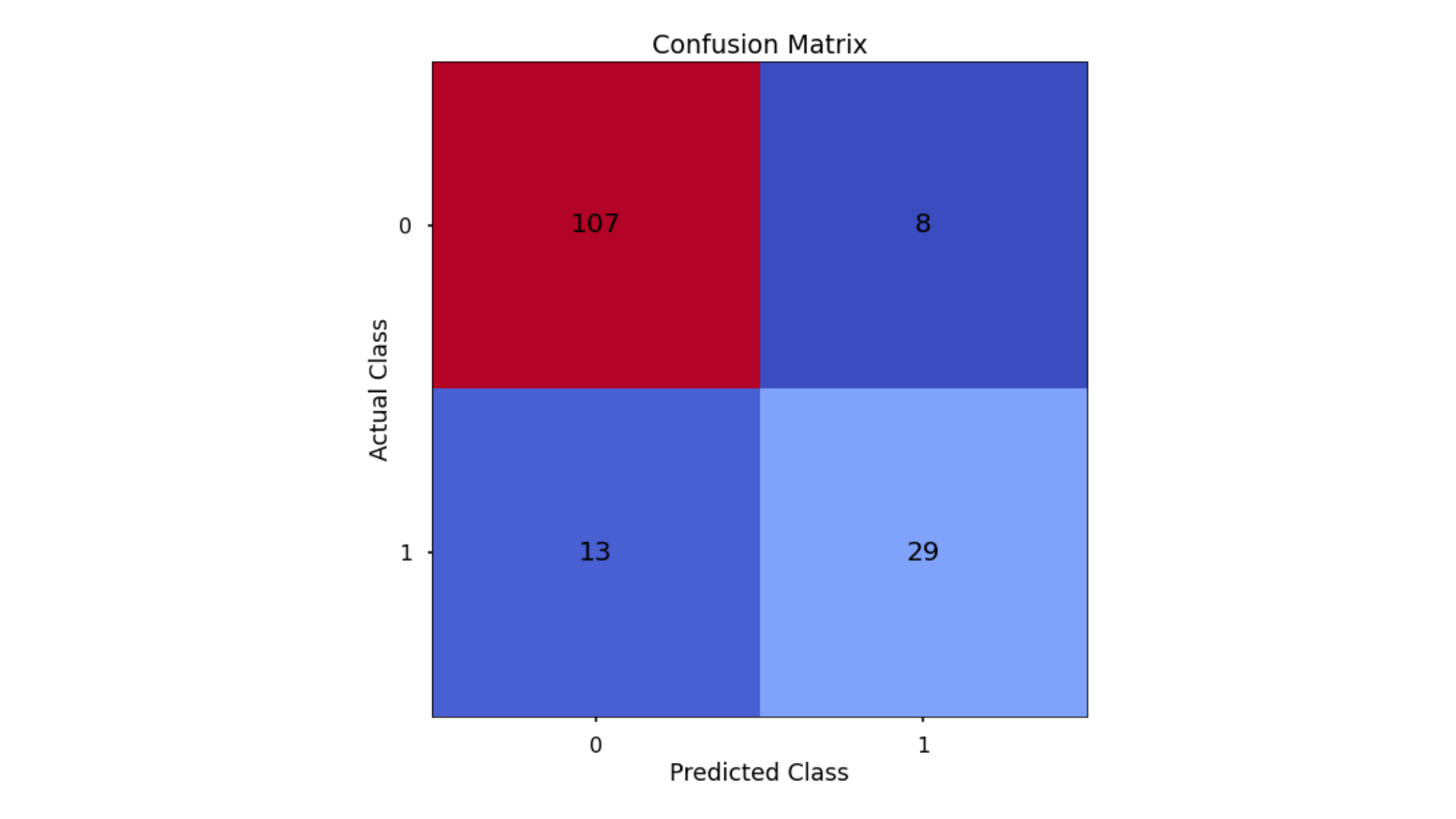
The aim is to have a high proportion of observations falling into the top left cell (predicted non-signup and actual non-signup) and the bottom right cell (predicted signup and actual signup).
Since the proportion of signups in our data was around 30:70 we will next analyze not only Classification Accuracy, but also Precision, Recall, and F1-Score which will help us assess how well our model has performed in reality.
Classification Performance Metrics
- Accuracy: A very intuitive metric, the accuracy measures the number of correct classification predictions out of all predictions made. This number could be very misleading when you have very imbalanced data. An example of imbalanced data is a dataset where we have a 98%/2% split across 2 classes (98% of patients without a disease and 2% with a disease). If our model predicts no one has the disease, we get an accuracy of 98% which wouldn’t be a great model in the real world.
- Precision: Answers the question: of all observations predicted as positive, what proportion was actually positive?
- Recall: Answers the question: of all positive observations, how many did we predict as positive?
Usually, trying to improve Precision has the opposite effect on Recall and vice-versa. So what metric to focus on is purely based on the project goals. - F1-Score: This is the harmonic mean of Precision and Recall. A good F1-score comes when there is a balance between precision and recall.
In the code below, we utilize in-built functionality from scikit-learn to calculate these four metrics.
# classification accuracy
accuracy_lr = round(accuracy_score(y_test, y_pred_class)*100, 2)
print(f"Accuracy score is {accuracy_lr}, meaning the model coorectly predicts {accuracy_lr}% of the test set observations")

# precision
precision_lr = round(precision_score(y_test, y_pred_class)*100, 2)
print(f"Precision score is {precision_lr}, meaning for our predicted delivery club signups, the model was correct {precision_lr}% of the time")

# recall
recall_lr = round(recall_score(y_test, y_pred_class)*100, 2)
print(f"Recall score is {recall_lr}, meaning of allactual delivery club signups, the model correctly predicts {recall_lr}% of the time")

# f1-score
f1_lr = round(f1_score(y_test, y_pred_class), 2)
print(f"F1 score is {f1_lr}")
Finding The Optimal Classification Threshold
By default, most pre-built classification models & algorithms will just use a 50% probability to discern between a positive class prediction (delivery club signup) and a negative class prediction (delivery club non-signup).
Just because 50% is the default threshold does not mean it is the best one for our task.
Here, we will test many potential classification thresholds, and plot the Precision, Recall & F1-Score, and find an optimal solution!
# set up the list of thresholds to loop through
thresholds = np.arange(0, 1, 0.01)

# create empty lists to append the results to
precision_scores = []
recall_scores = []
f1_scores = []

# loop through each threshold - fit the model - append the results
for threshold in thresholds:

    pred_class = (y_pred_prob >= threshold) * 1

    precision = precision_score(y_test, pred_class, zero_division = 0)
    precision_scores.append(precision)

    recall = recall_score(y_test, pred_class)
    recall_scores.append(recall)

    f1 = f1_score(y_test, pred_class)
    f1_scores.append(f1)

# extract the optimal f1-score (and it's index)
max_f1 = max(f1_scores)
max_f1_idx = f1_scores.index(max_f1)


# plot the results
plt.style.use("seaborn-poster")
plt.plot(thresholds, precision_scores, label = "Precision", linestyle = "--")
plt.plot(thresholds, recall_scores, label = "Recall", linestyle = "--")
plt.plot(thresholds, f1_scores, label = "F1", linewidth = 5)
plt.title(f"Finding the Optimal Threshold for Classification Model \n Max F1: {round(max_f1,2)} (Threshold = {round(thresholds[max_f1_idx],2)})")
plt.xlabel("Threshold")
plt.ylabel("Assessment Score")
plt.legend(loc = "lower left")
plt.tight_layout()
plt.show()
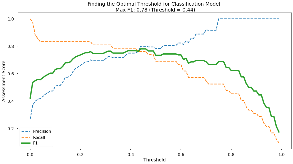
Along the x-axis of the above plot we have the different classification thresholds that were testing. Along the y-axis we have the performance score for each of our three metrics. As per the legend, we have Precision as a blue dotted line, Recall as an orange dotted line, and F1-Score as a thick green line. You can see the interesting “zero-sum” relationship between Precision & Recall and you can see that the point where Precision & Recall meet is where F1-Score is maximised.
As you can see at the top of the plot, the optimal F1-Score for this model 0.78 and this is obtained at a classification threshold of 0.44. This is higher than the F1-Score of 0.734 that we achieved at the default classification threshold of 0.50!
Model 2: Decision Trees
The same steps in Logistic Regression will be used for the Decision Trees - with some minor differences.
Encode Categorical Variables
Using the same method as in Logistic Regression, we encode the gender variable using DataFrameMapper and LabelBinzrizer. Since this is a decision tree, we do not need to scale the numerical variables, so None is an argument in the mapper, indicating that no transformation is to be done on the numerical variables.
mapper_dt = DataFrameMapper([
    (['distance_from_store'], None),
      ('gender', LabelBinarizer()),
      (['credit_score'], None),
      (['total_sales'],None),
       (['total_items'], None),
      (['transaction_count'],None),
      (['product_area_count'],None),
       (['average_basket_value'], None)], df_out = True)

mapper_dt.fit(X_train)

Z_train_dt = mapper_dt.transform (X_train)
Z_test_dt = mapper_dt.transform(X_test)
Model Training
The code below instantiates the Decision Tree model with a random state specified for reproducibility and a maximum depth to prevent over-fitting.
# Instantiate our model object
dt = DecisionTreeClassifier(random_state = 42, max_depth = 5)
Model Assessment
As before, we would generate the predicted class on the test data, and calculate the accuracy, precision, recall and F1-score.
# create the confusion matrix
conf_matrix = confusion_matrix(y_test, y_pred_class_dt)

# plot the confusion matrix
plt.style.use("seaborn-poster")
plt.matshow(conf_matrix, cmap = "coolwarm")
plt.gca().xaxis.tick_bottom()
plt.title("Confusion Matrix")
plt.ylabel("Actual Class")
plt.xlabel("Predicted Class")
for (i, j), corr_value in np.ndenumerate(conf_matrix):
    plt.text(j, i, corr_value, ha = "center", va = "center", fontsize = 20)
plt.show()
accuracy_dt = round(accuracy_score(y_test, y_pred_class_dt)*100, 2)
print(f"Accuracy score is {accuracy_dt}, meaning the model correctly predicts {accuracy_dt}% of the test set observations")

# precision
precision_dt =  round(precision_score(y_test, y_pred_class_dt)*100, 2)
print(f"Precision score is {precision_dt}, meaning for our predicted delivery club signups, the model was correct {precision_dt}% of the time")

# recall
recall_dt= round(recall_score(y_test, y_pred_class_dt)*100, 2)
print(f"Recall score is {recall_dt}, meaning of actual delivery club signups, the model correctly predicts {recall_dt}% of the time")

# f1-score
f1_dt = round(f1_score(y_test, y_pred_class_dt), 2)
print(f"F1 score is {f1_dt}")
Plot Decision Tree
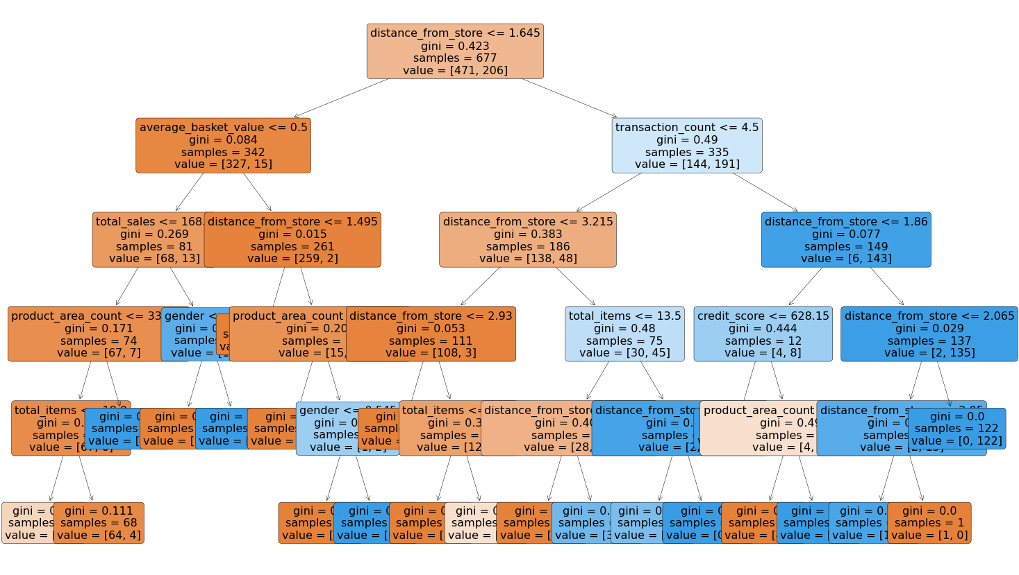
For Decision Trees, we can literally plot out the Decision Tree which shows us how the splits were made.
plt.figure(figsize=(25,15))
tree = plot_tree(dt,
                 feature_names = X.columns,
                 filled = True,
                 rounded = True,
                 fontsize = 16)
Finding the Best Max Depth to Prevent Overfitting
max_depth_list = list(range(1,20))
accuracy_scores = []

# loop through each possible depth, train and validate model, append test set f1-score
for depth in max_depth_list:

    dt = DecisionTreeClassifier(max_depth = depth, random_state = 42)
    dt.fit(Z_train_dt,y_train)
    y_pred_dt = dt.predict(Z_test_dt)
    accuracy = f1_score(y_test,y_pred_dt)
    accuracy_scores.append(accuracy)

# store max accuracy, and optimal depth
max_accuracy = max(accuracy_scores)
max_accuracy_idx = accuracy_scores.index(max_accuracy)
optimal_depth = max_depth_list[max_accuracy_idx]

df = pd.DataFrame({'max_depth_list': max_depth_list, 'accuracy_scores': accuracy_scores})

# plot accuracy by max depth
px.line(df, x = "max_depth_list", y = "accuracy_scores",
        title = f"Accuracy (F1 score) by Max Depth \n Optimal Tree Depth: {optimal_depth} (F1 Score: {round(max_accuracy, 4)})")
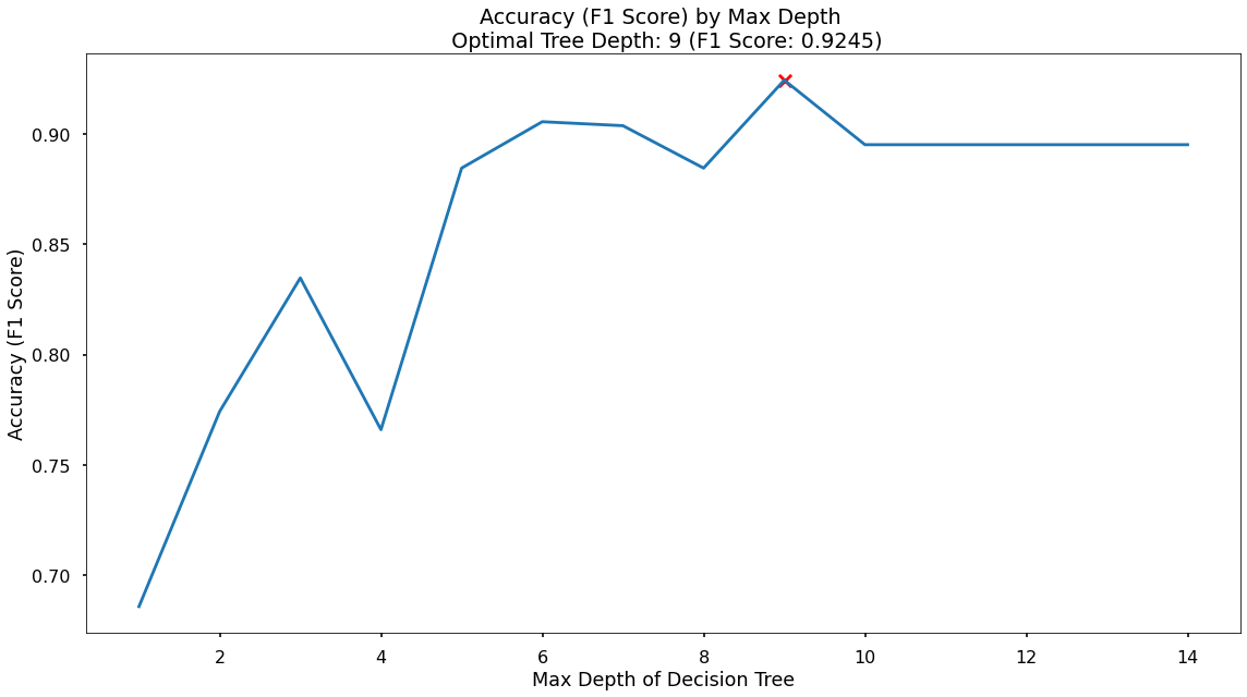
The plot above shows us that the maximum F1-score on the test set is found when applying a maximum depth value of 5.
Model 3: Random Forest (Ensemble)
The same process of instantiating, fitting and assessing the model is followed. For code, go to the Jupyter Notebook
Model 4: K Nearest Neighbors (KNN)
The same process of instantiating, fitting and assessing the model is followed. For code, go to the Jupyter Notebook
Results
The goals of the project were:
- Build a model that would accurately predict the customers that would sign up for the delivery club. This would allow for a much more targeted approach when running the next iteration of the campaign.
- Understand what the drivers for this are, so the client can get closer to the customers that need or want this service, and enhance their messaging.
Based upon these, the chosen model is the Random Forest as it was:
- the most consistently performant on the test set across classification accuracy, precision, recall, and F1-score, and
- the feature importance and permutation importance allow the client an understanding of the key drivers behind delivery club signups. See the table below for a summary of all model results.

Key Drivers of Delivery Club Signups
As well, the feature importances and permutation importances of the various input variables are shown below. This shows the key drivers behind the delivery club signups, which in this case are: Distance from Store and Transaction Count.
Application
We now have a model object, and the required pre-processing steps to use this model for the next delivery club campaign. When this is ready to launch we can aggregate the necessary customer information and pass it through, obtaining predicted probabilities for each customer signing up.
Based upon this, we can work with the client to discuss where their budget can stretch to, and contact only the customers with a high propensity to join. This will drastically reduce marketing costs, and result in a much-improved ROI.
Growth & Next Steps
While predictive accuracy was relatively high - other modelling approaches could be tested, especially those somewhat similar to Random Forest, for example, XGBoost and LightGBM to see if even more accuracy could be gained.
We could even look to tune the hyperparameters of the Random Forest, notably regularisation parameters such as tree depth, as well as potentially training on a higher number of Decision Trees in the Random Forest.
From a data point of view, further variables could be collected, and further feature engineering could be undertaken.


